Valkiria
Valkiria is an Argentinian brewery, they produce beer and have their own bar. Given the reduced population of the location the objective was to attract a younger more varied audience (without alienating the older and predominantly male previous consumer).
The Process
How it came together.
Logo concept
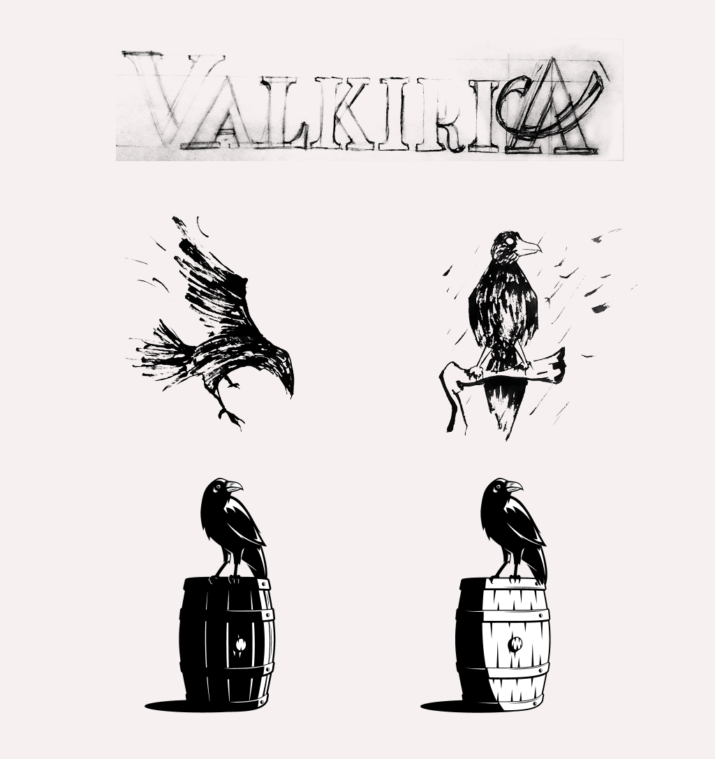
The logo was inspired by the nordic myth of valkyries that came to the battlefields in the form of crows to take the souls of the warriors and guide them to the valhalla. This was because the crow makes for a powerful icon and it corresponds with the name of the brand.
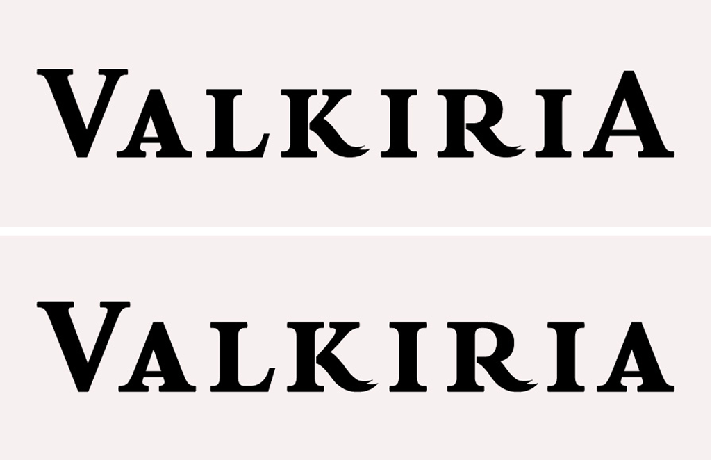
Custom lettering
For the text we do a custom lettering, hand drawn, vectorized and fine tuned. This was to make sure that the kerning of different pairs (like V and A or A and L) fit well together.We also add details to some letters to give them the feather feel.We make two versions, one for left margin and one for centered design
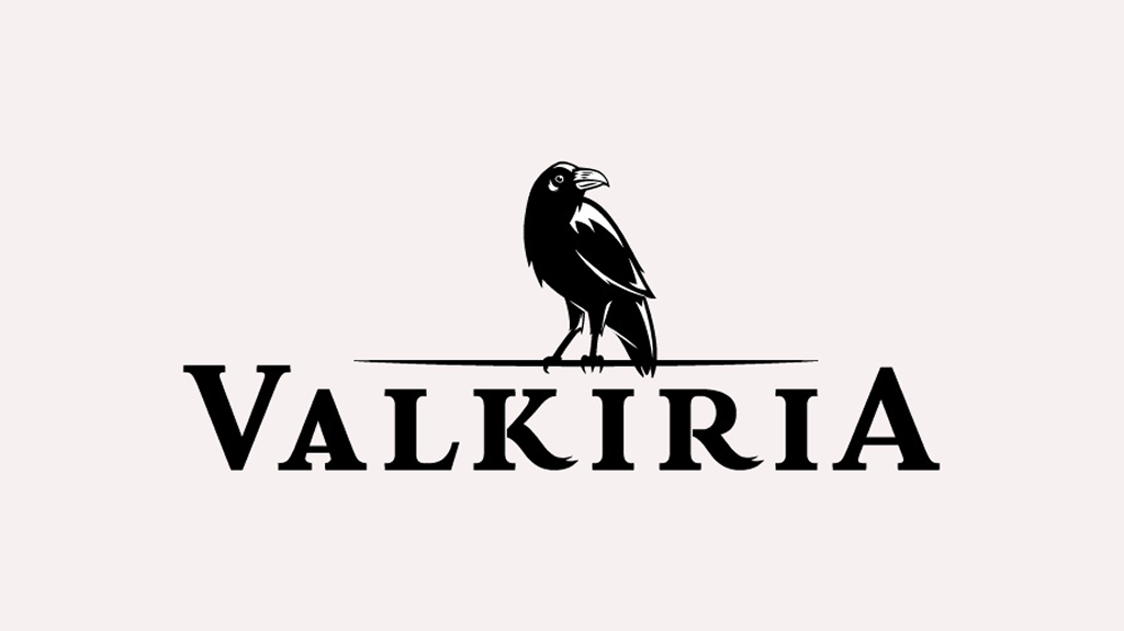
Final logo
For the final logo we discarded the barrel because it was too much detail and we wanted the crow to be the protagonist.
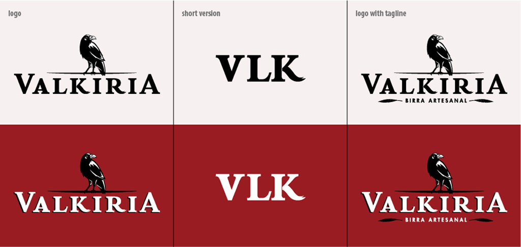
Logo variations
We make three levels of complexity for different uses. The smallest one uses the concept of feathers to keep the crow in the mind of the consumer.
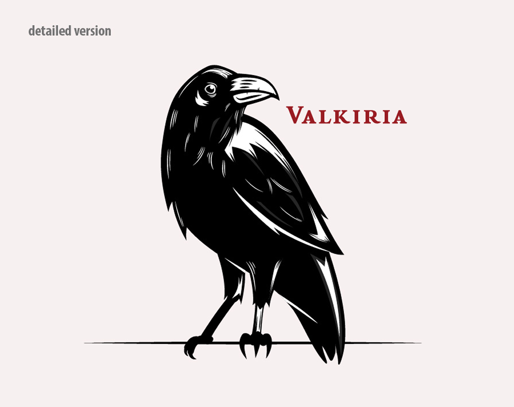
Detailed crow
For the larger uses and situacions that demand close ups we did a detailed version of the crow. Detailed versions are not alwais necessary, but i mighy be for faster and cheap labels (it is a small brewery) and if the logo must be used alone.
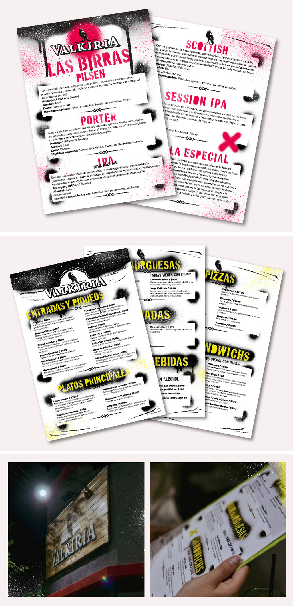
Menu design
As said, the aesthetics of the menu is an urban and street intervention style, somewhat rebellious but friendly that appeal to a more younger audience, this contrast with the more serious logo and make it pop while the menu itself is memorable and flashy.
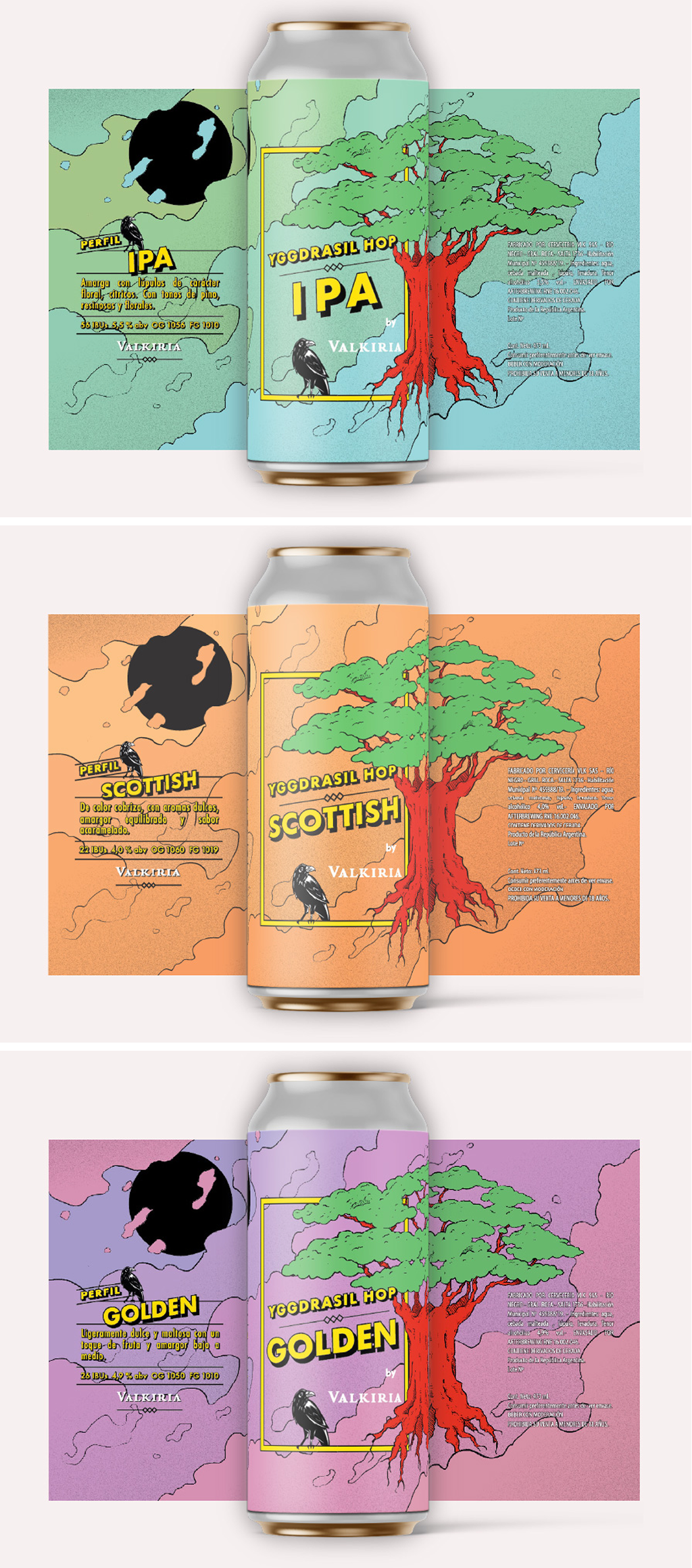
Can packaging
Later in production the company needed cans to sell the product. We make it colorful and mysterious and use other elements of the nordic mythology with hand drawn illustrations.