Sushisur (Fibonacci Group)
Sushisur is an Argentinian sushi company with four places across four cities. They are growing and becoming a very important and popular brand, so they needed to reflect this in their visual communication.
Visit sushisur.com.ar ↗The Process
How it came together.
Concept exploration
The first step is an exploration of the different concepts. This is a redesign so is very important to understand the essence of the logo.a

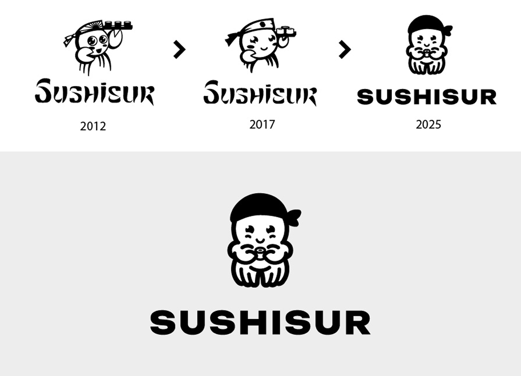
Logo evolution
This is a comparison of the evolution of the logo. The refresh was aiming to simplify and giving a more serious brand feel without losing playfulness and personality.
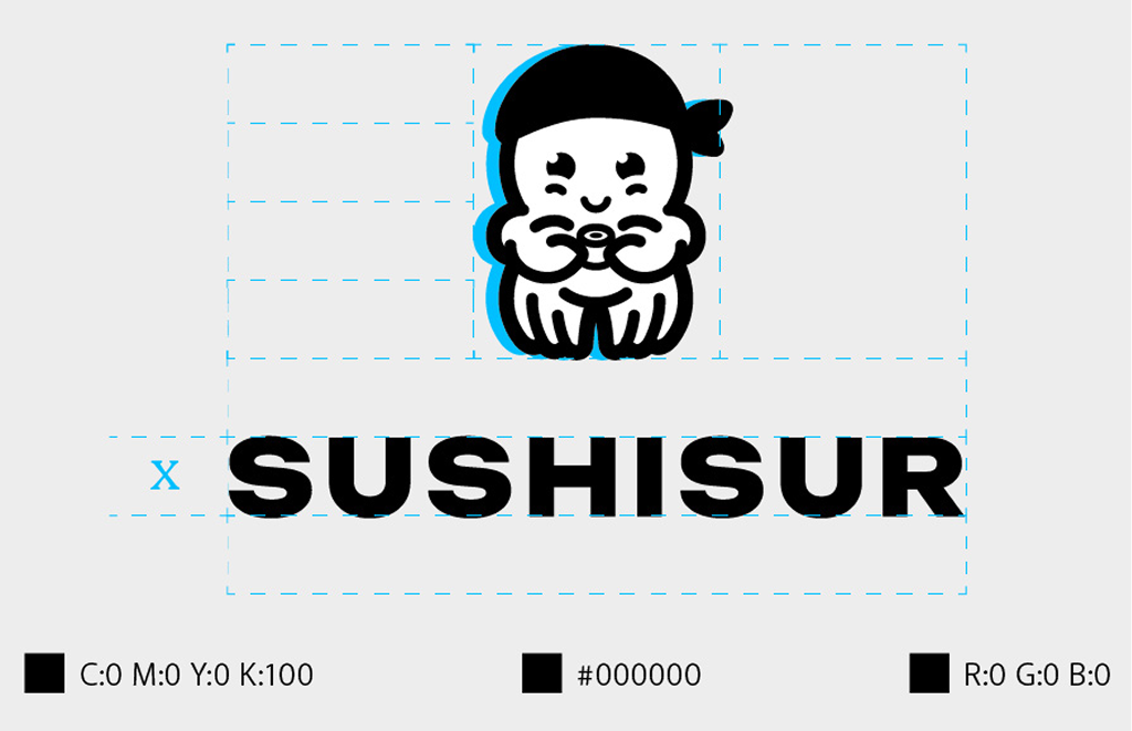
Grid & correction
Once established the brad aspects we did the griding and optical correction for a good perception of balance.
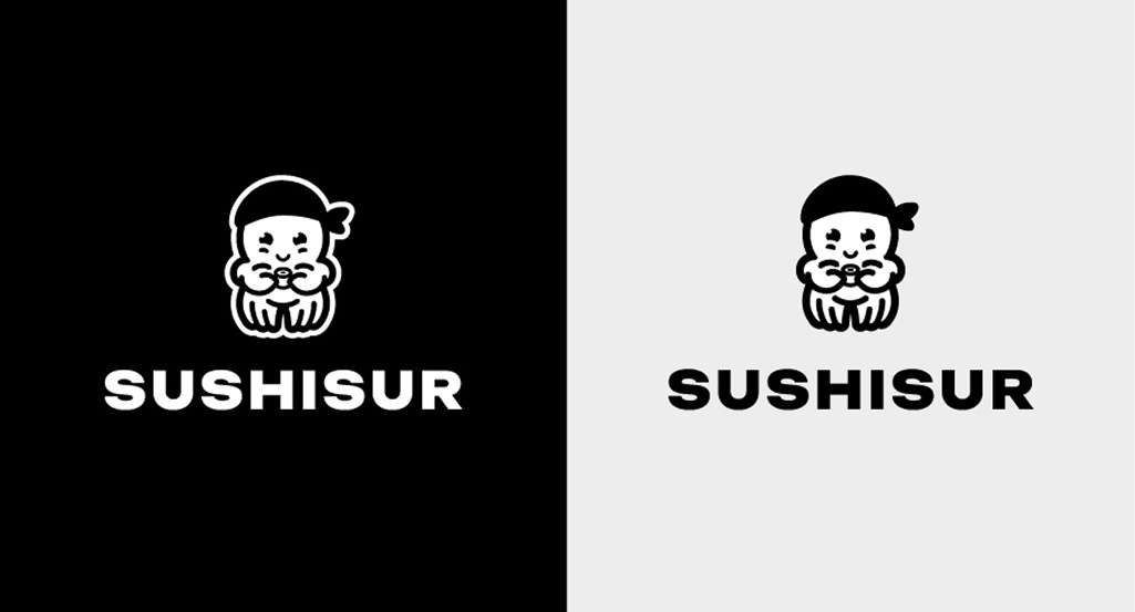
Negative version
Then we make a negative version of the brand for dark backgrounds.
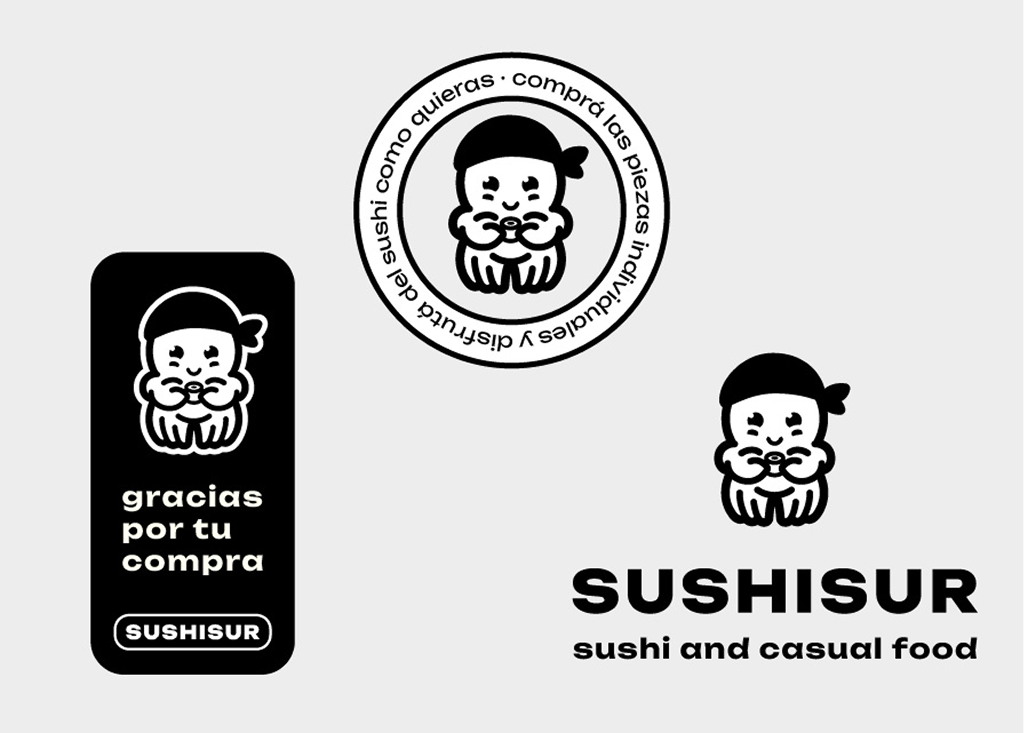
Dynamic uses
Different possibilities of use to make the logo dynamic.
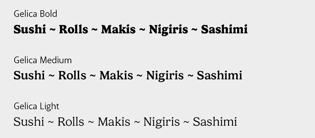
Typography
For the communication we choose a playful and warm type. To make the brand look friendly an accessible.
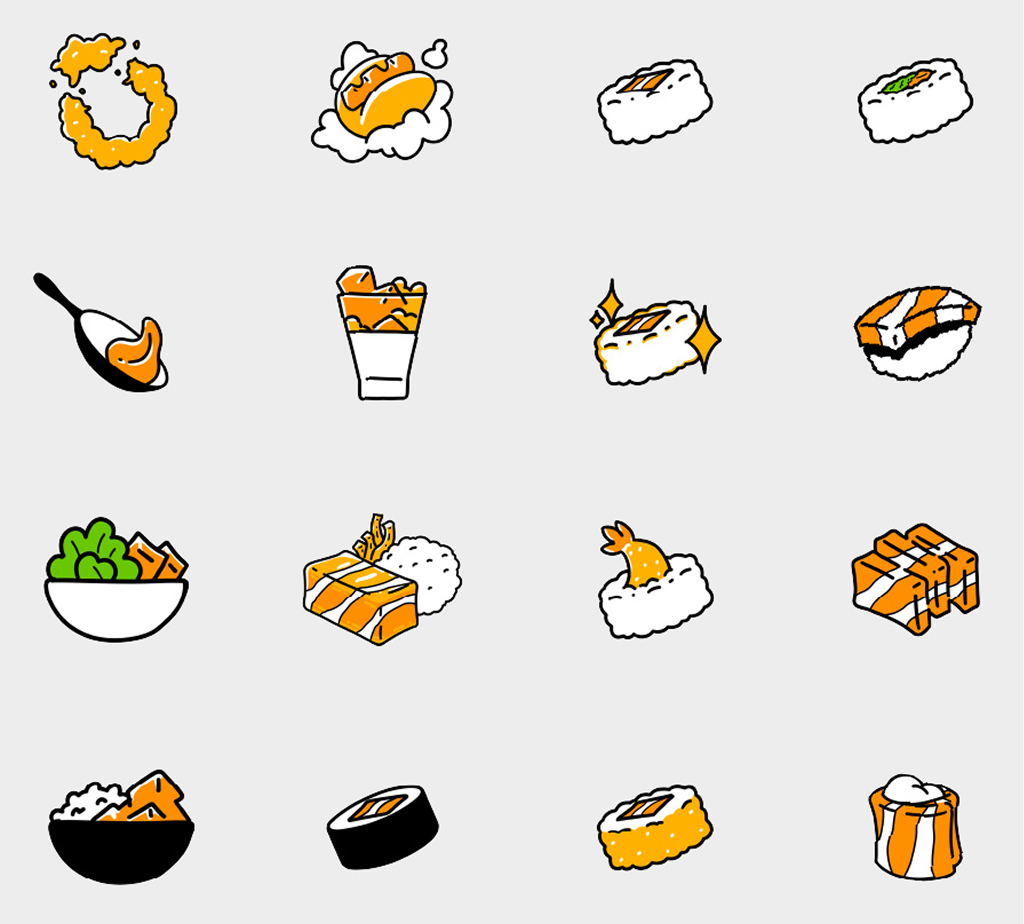
Custom illustrations
We did personalized illustrations for the menu and communications using a limited color pallet to reinforce the brand aesthetic.
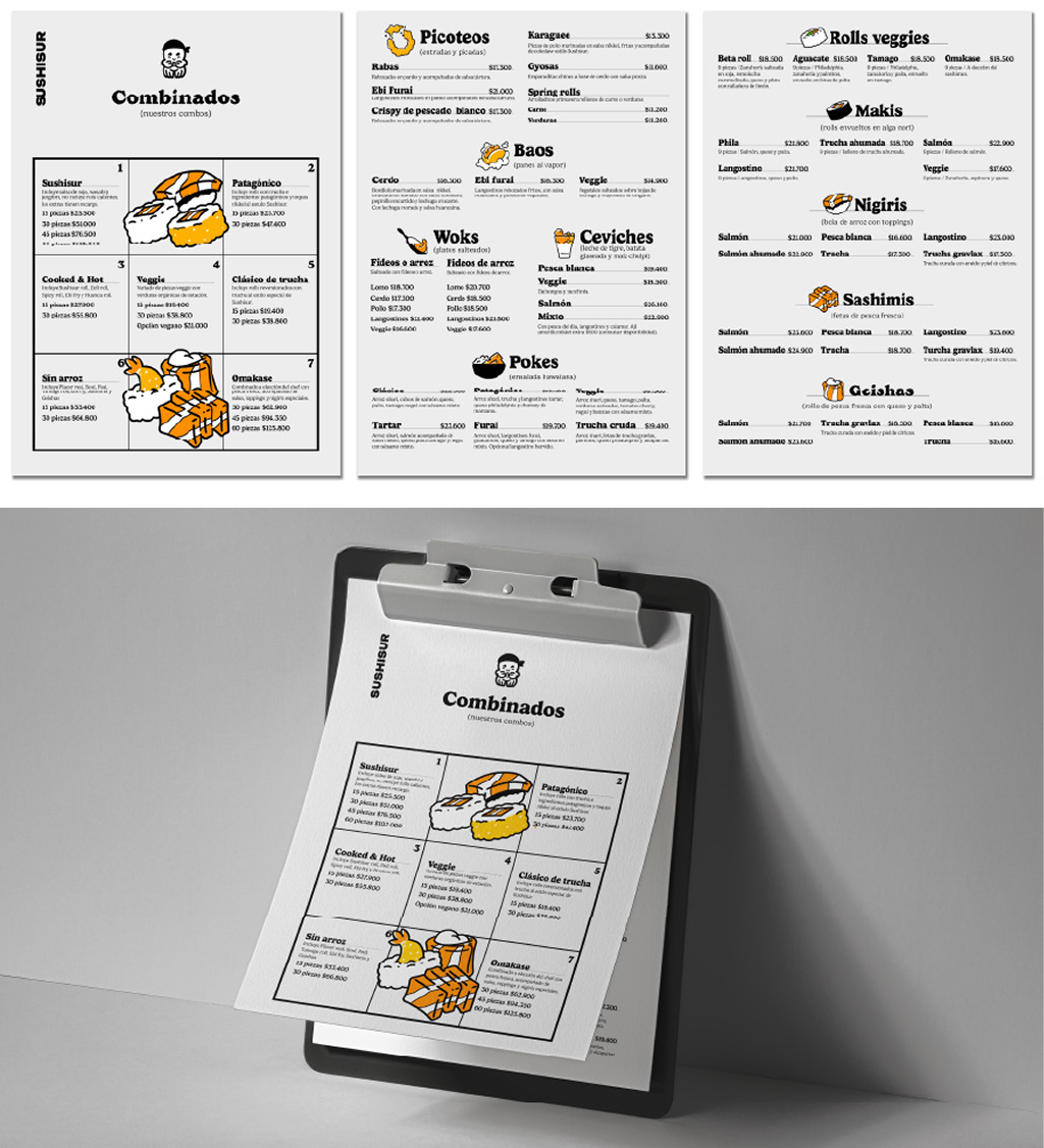
Applied to the menu
And we applied it to the menu.
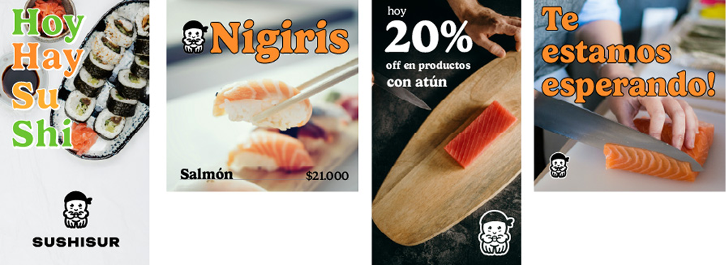
Social media
We did some suggested use for social media.
Staff attire
And the design for the staff clothing.
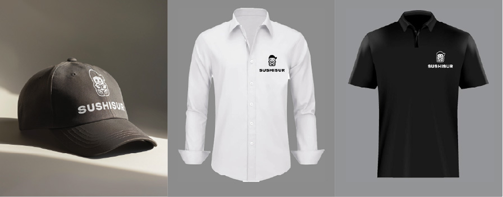
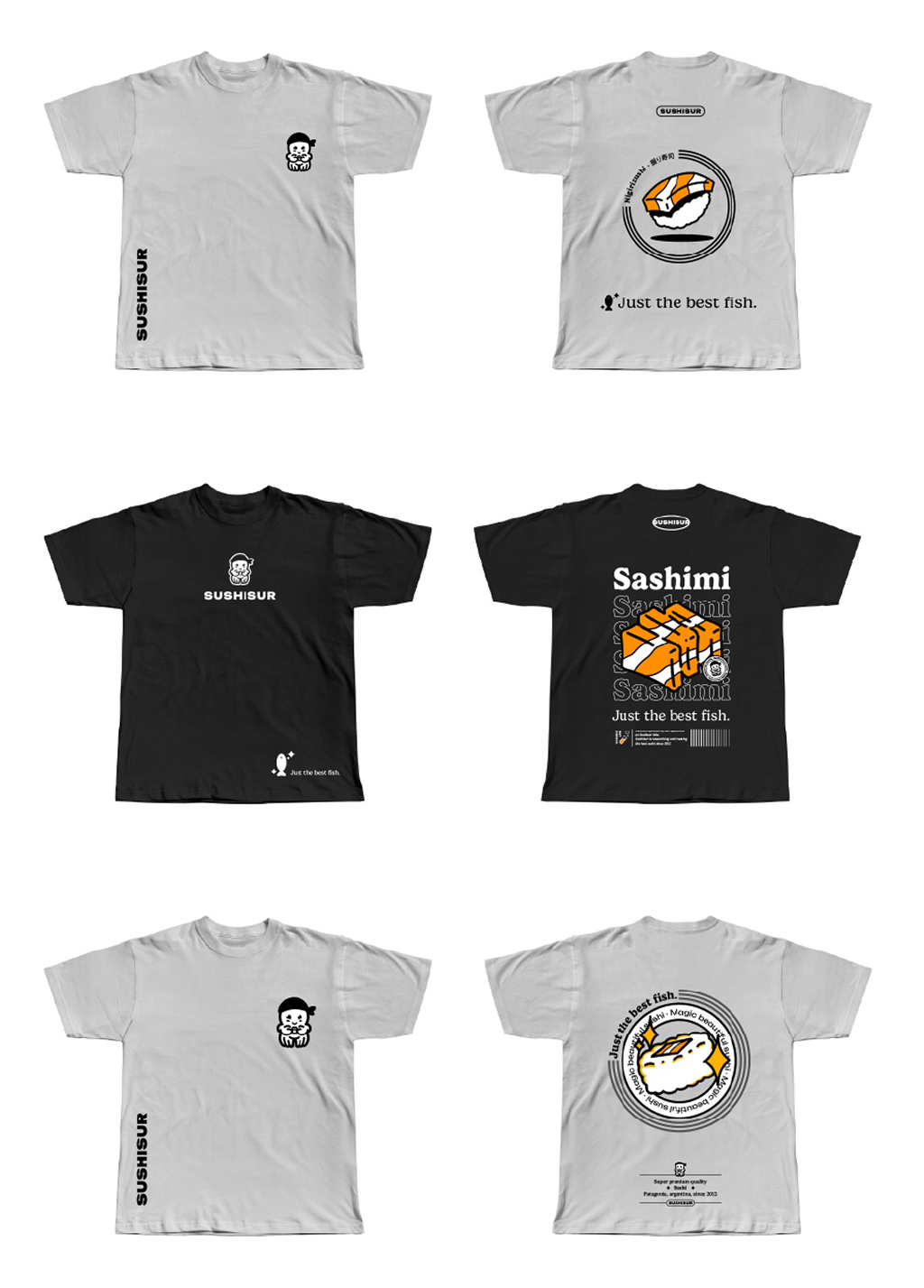
Merchandise shirts
And then some extra design for shirts to sell as merchandising.