Voxly
Voxly is a concept brand that aims to connect artist and content creators on their social platform.
The Process
How it came together.
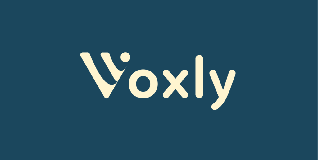
Logo concept
The logo needed to be simple and easily understood. The logo embodies the core concepts of communication and a sense of community
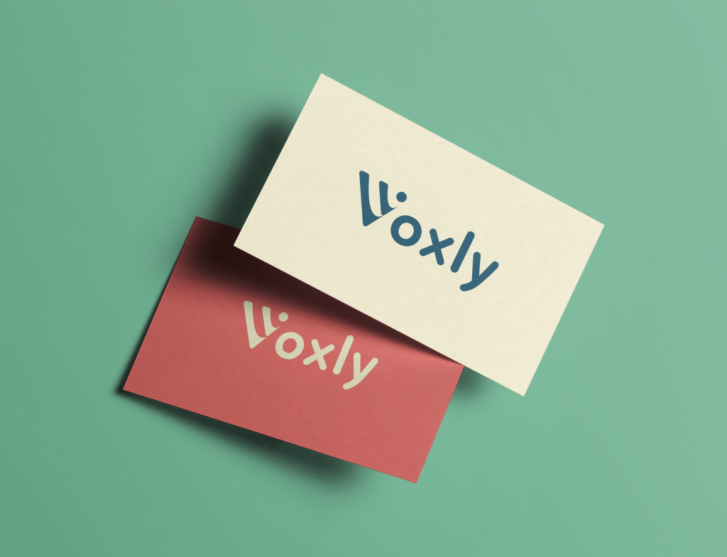
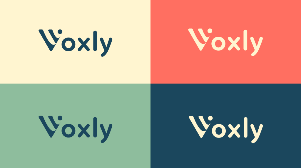
Logo versatility
The logo also needed to work well on a variety of backgrounds with different color combinations
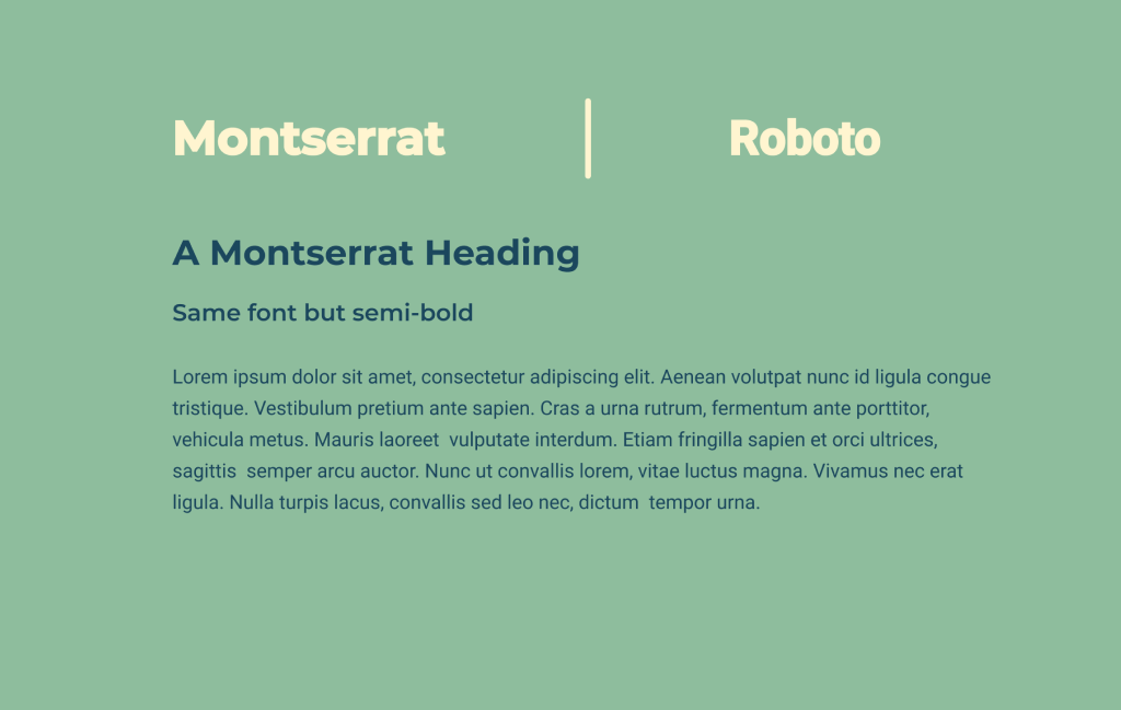
Typography
The choice of fonts were Montserrat and Roboto. The former was used for Headings and Sub-Headings because of its bold appeal while the latter was used as the body text for its modern look and readability
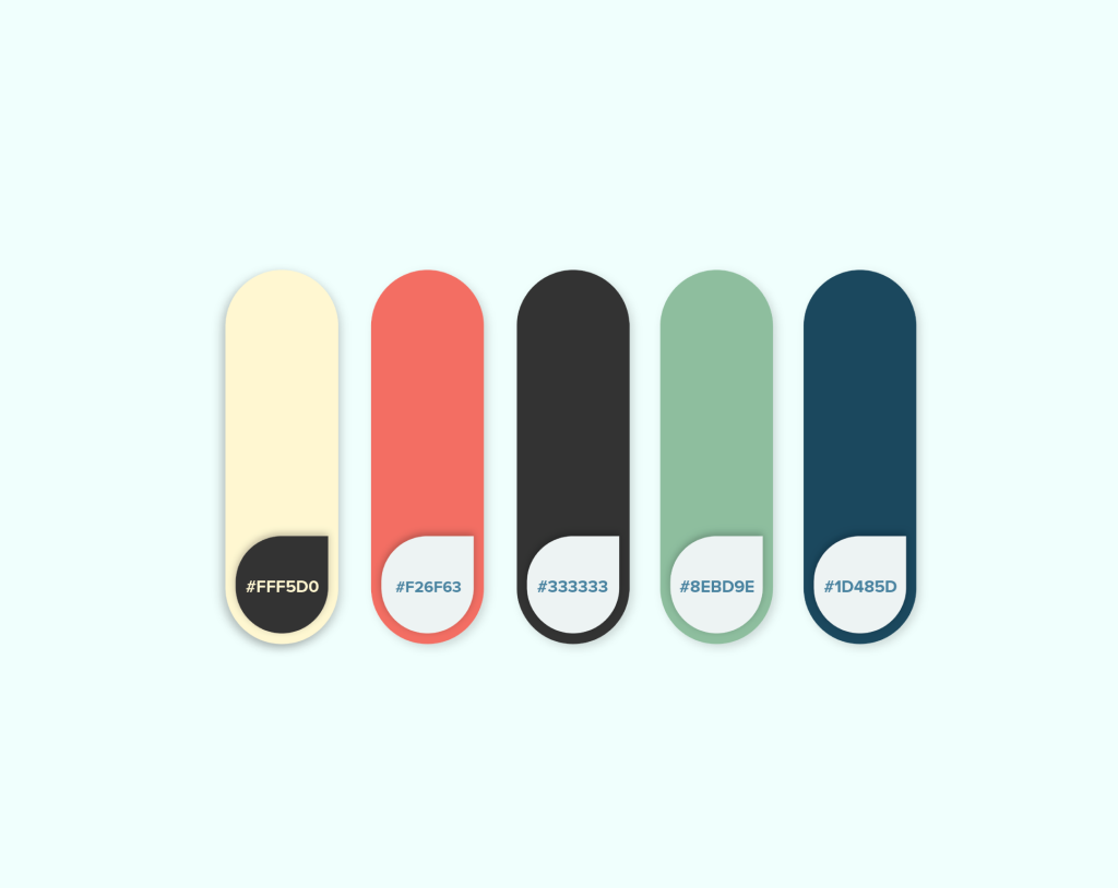
Color palette
These were the colors chosen for Voxly. The goal was to have a set of colors that were friendly and inviting and had a decent contrast between the lighter and darker colors.
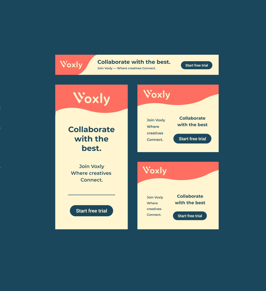
Banner ads
Various banner ads were created for Voxly that can potentially be used to increase engagement for the website
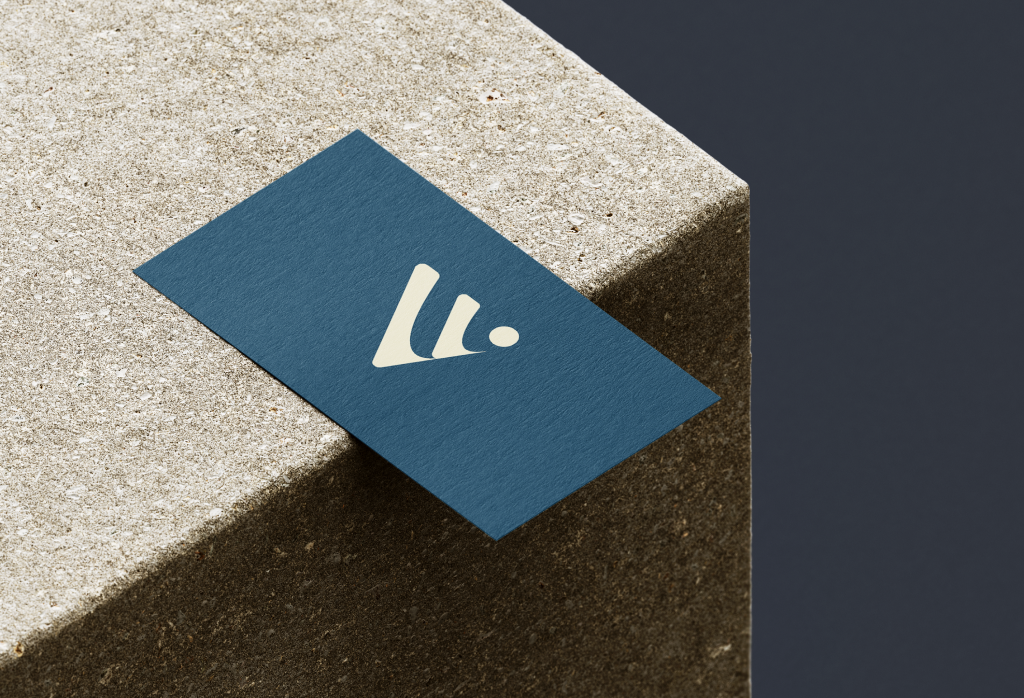
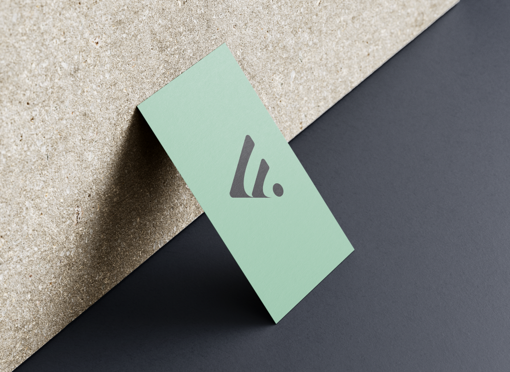
Business card
Below are various mockups that help visualize how the brand might look on a business card