1
The logo needed to be simple and easily understood. The logo embodies the core concepts of communication and a sense of community

2
The logo also needed to work well on a variety of backgrounds with different color combinations

3
The choice of fonts were Montserrat and Roboto. The former was used for Headings and Sub-Headings because of its bold appeal while the latter was used as the body text for its modern look and readability
4
These were the colors chosen for Voxly. The goal was to have a set of colors that were friendly and inviting and had a decent contrast between the lighter and darker colors.
5
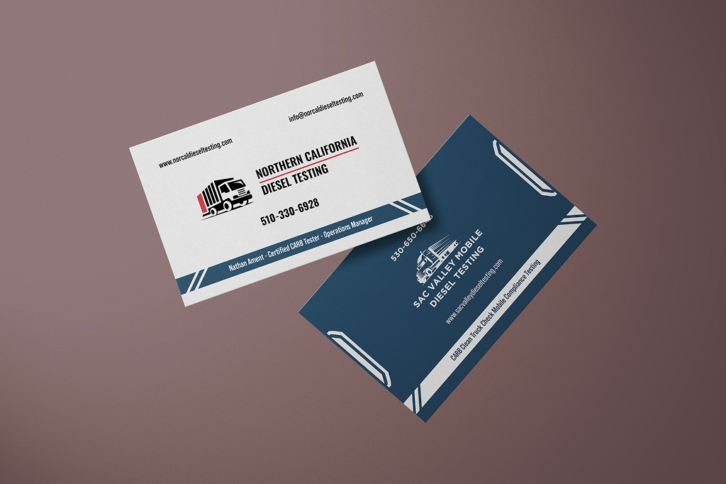
The next designs were business cards for the company. The client owned two such companies and wanted a business card that represented these companies on either side.
