Lono
Lono is a poke place that also sells rolls and salads. The name is based on a Hawaiian god so we use that as a concept and connect it to the ocean to transmit freshnes and a feeling of peace.
The Process
How it came together.
Concept exploration
The first step is an exploration of the different concepts. Trying to understand the feeling of Hawaii and the ocean and what it means to be fresh.
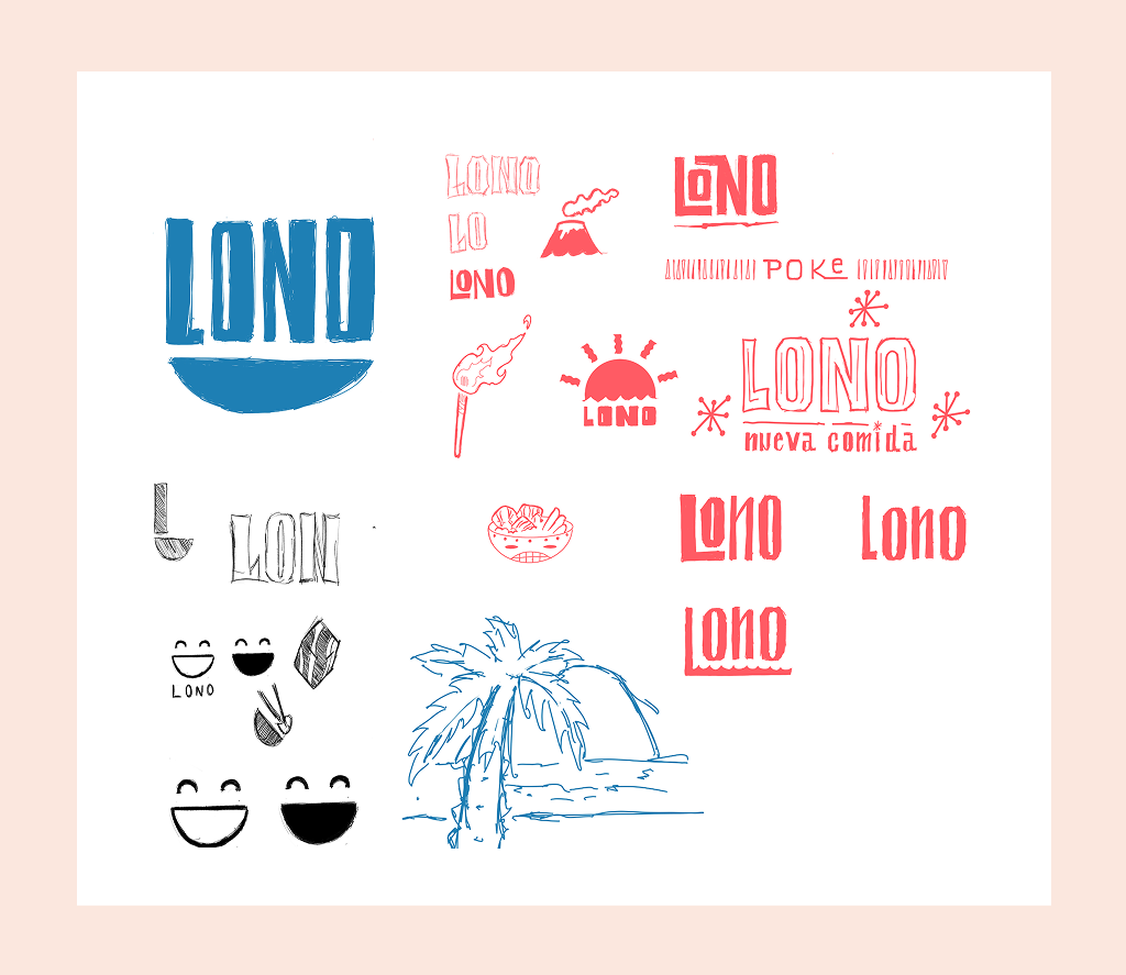
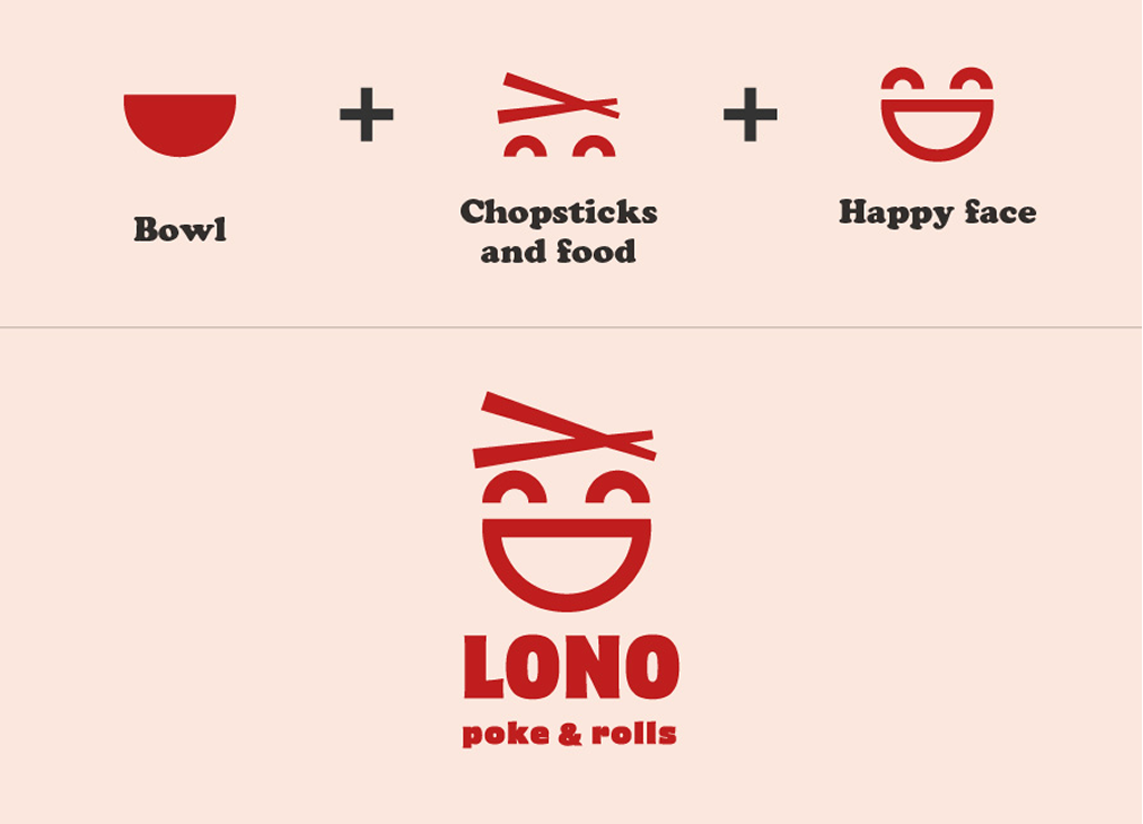
Building the mark
The concept behind the logo is simple, aiming to develop a concise and recognizable icon that also communicates the brand in a fast and strong way. That is also why we used red, is a strong color that gives a new brand more strength.
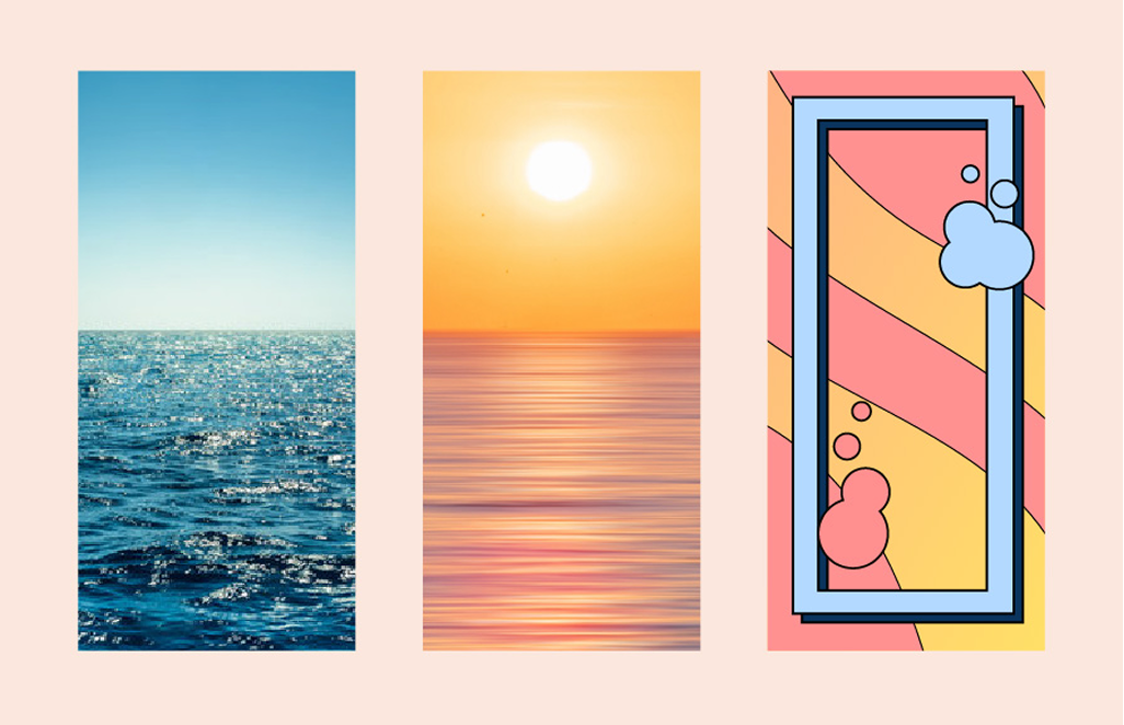
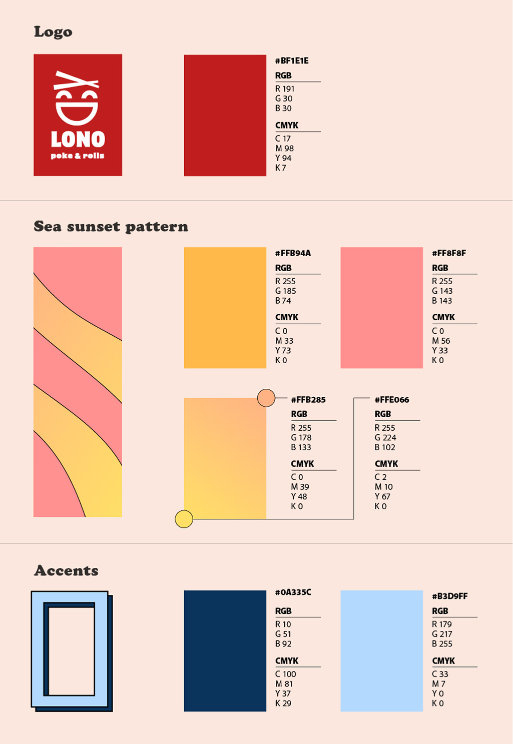
Color from the ocean
We based the color pallette and the patterns in the sea. Regular and sunset for the freshness, peaceful and calm feeling.
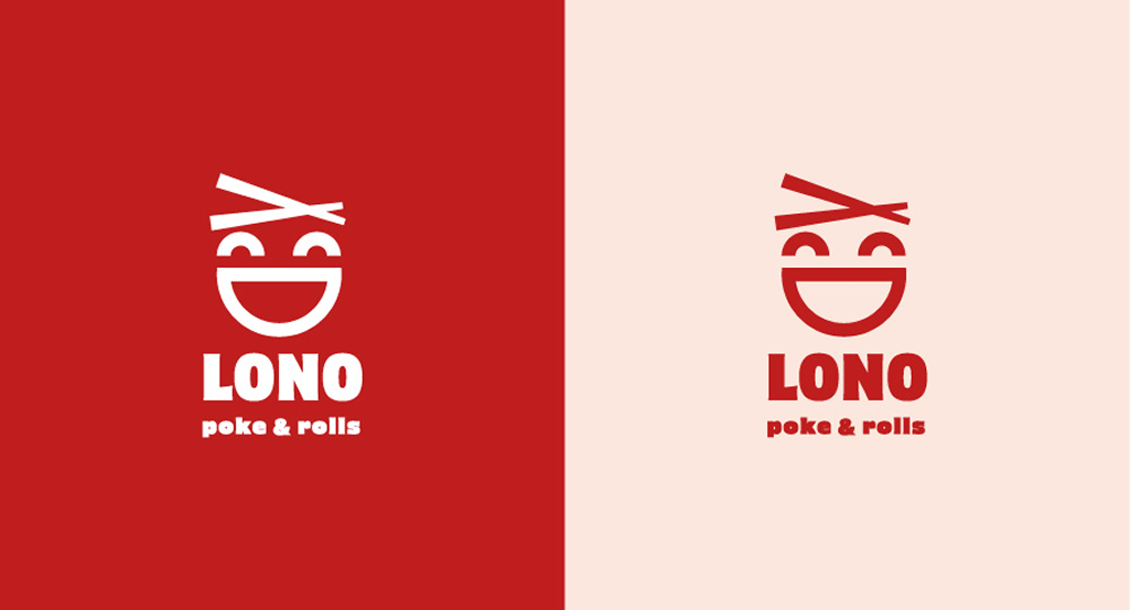
Negative & positive
The logo works good in negative and positive without much change.
Color palette
The colors used reflect the concepts of ocean, calm and freshnes, and this is used with the red of the logo to make it more impactful.
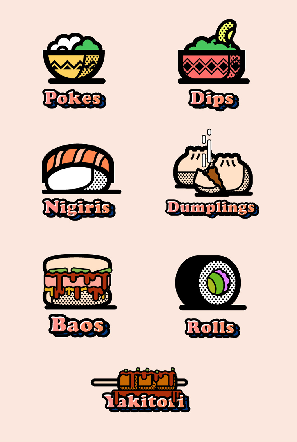
Custom illustrations
To make the elements of the branding we did illustrations, this is useful to make the menus more readable but also gives the brand more personality.
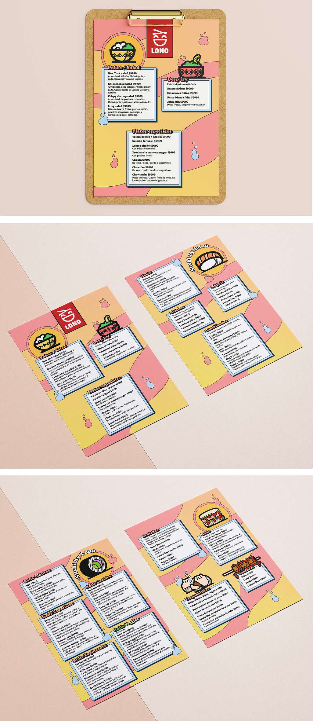
Applied to the menu
And we applied it to the menu.
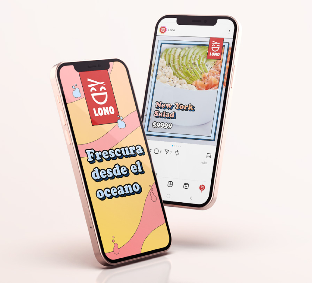
Out in the world
We did some suggested use for social media.